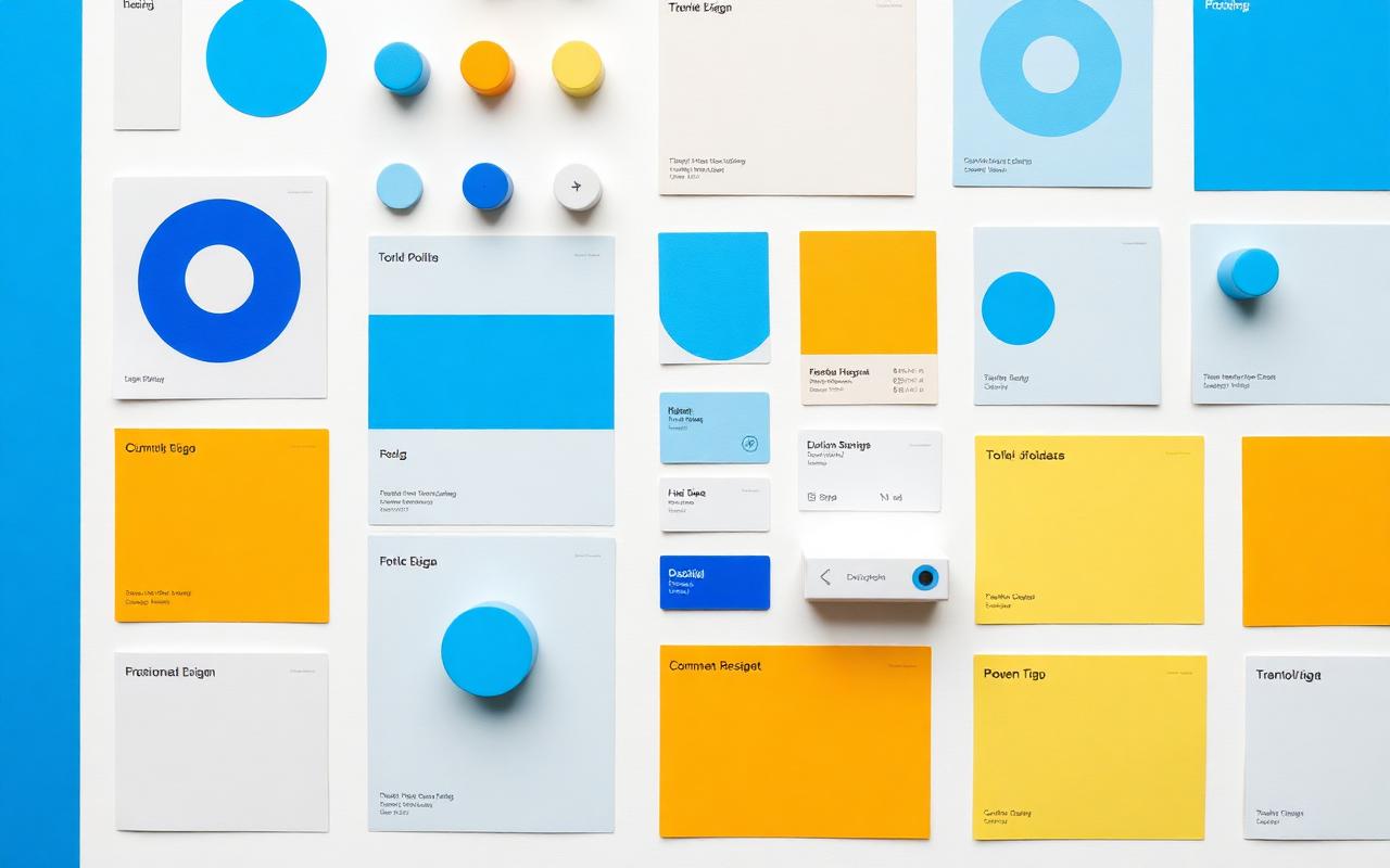
Design tokens
Colour roles, type scale, spacing rhythm and motion durations with contrast floors built in.
Design Systems & Front End
We build the token layer first, then the components, then the documentation — and we hand over the implemented code so nothing is lost between design and build.
Start a project →
The tokens, components, patterns, accessibility standards and documentation that let a team ship consistent interfaces without re-litigating every screen.
Tokens before components. Code alongside design. Documentation short enough that people actually read it.
What we offer
Colour roles, type scale, spacing rhythm and motion durations with contrast floors built in.
Designed and implemented together in React, with every state covered.
Keyboard models, focus systems and live regions defined once, reused everywhere.
Usage rules, do/don't examples and the reasoning behind each decision.
A sequenced path from the current codebase without a freeze.
Contribution model, review cadence and ownership after we leave.
Process
01
Every existing variant, catalogued — usually a sobering number.
02
Scales and roles settled before any component is drawn.
03
The twenty that cover eighty percent of screens, built and tested.
04
Composite behaviour: forms, tables, navigation, empty and error states.
05
Migrate real screens with your team, in your codebase.
06
Governance, docs and a contribution model your team owns.
Benefits
We agree the measure before the work starts, so this section isn't a matter of taste.
Fewer open questions per screen means fewer meetings per feature.
Design and code arrive as the same artefact.
Compliance lives in the components, not in a final-sprint audit.
A token change updates the product, not a hundred files.
Industries we do this for
Related work
FAQs
Further reading
Powered by Musebit AI
Musebit AI handles research synthesis, design exploration, brand concepts and content so the work reaches a decision sooner.
Next service
MVP Development
Launch your MVP
Let's talk
We'll schedule a call to discuss your idea. After a short discovery session we send a proposal, and once it's approved we get started.